Skip to content



Fortnum & Mason’s mobile-heavy audience faced friction when browsing complex hamper options, where similar products made decision-making harder. REO combined user research, behavioural data, and experimentation to surface the right information at the right time, improving clarity and driving more confident purchasing decisions.
By combining insight and experimentation, REO helped us simplify complex choices and unlock meaningful gains in mobile conversion.
Sarah Wilkinson
Our contributions
- Behavioural analytics and insight
- Moderated user testing
- Experimentation strategy
- Mobile UX/UI design
- Personalisation
Our Tech Partners :




Challenges
Fortnum & Mason’s site attracts a predominantly mobile audience, yet conversion rates on desktop significantly outperform mobile. Early analysis suggested a pattern of cross-device behaviour, with users browsing on mobile before completing purchases on desktop.
Seasonal gifting plays a central role in the business, with hampers representing a key revenue driver. However, the breadth of options, many with subtle differences in contents can introduce complexity into the decision-making process.
In a category where consideration is high and purchases are often occasion-led, too much similarity risks creating friction rather than clarity.
The challenge was to optimise the experience in a way that supports varied user intents, ensuring the right information is surfaced at the right moment. Rather than simplifying the range, the focus was on guiding users through it, helping them confidently navigate choice and move towards purchase.
The REO approach
REO Approach
REO began the programme with moderated usability testing, engaging both existing Fortnum & Mason customers and prospective audiences across a range of age demographics. Sessions were conducted across mobile and desktop to capture behavioural differences and understand how users navigate high-consideration gifting journeys on different devices.
This approach enabled the team to understand not only where users dropped off in journeys, but also how they interacted with page elements and where engagement did not translate into progression.
Key findings included:
- Difficulty finding the right level of detail to confidently choose between similar hampers
- Strong reliance on price as a primary decision-making filter when purchasing
- Greater guidance expectation within “create your own hamper” experience
- Demand for larger, more detailed product imagery on mobile
Deliverables
PDP Hamper Contents
Problem
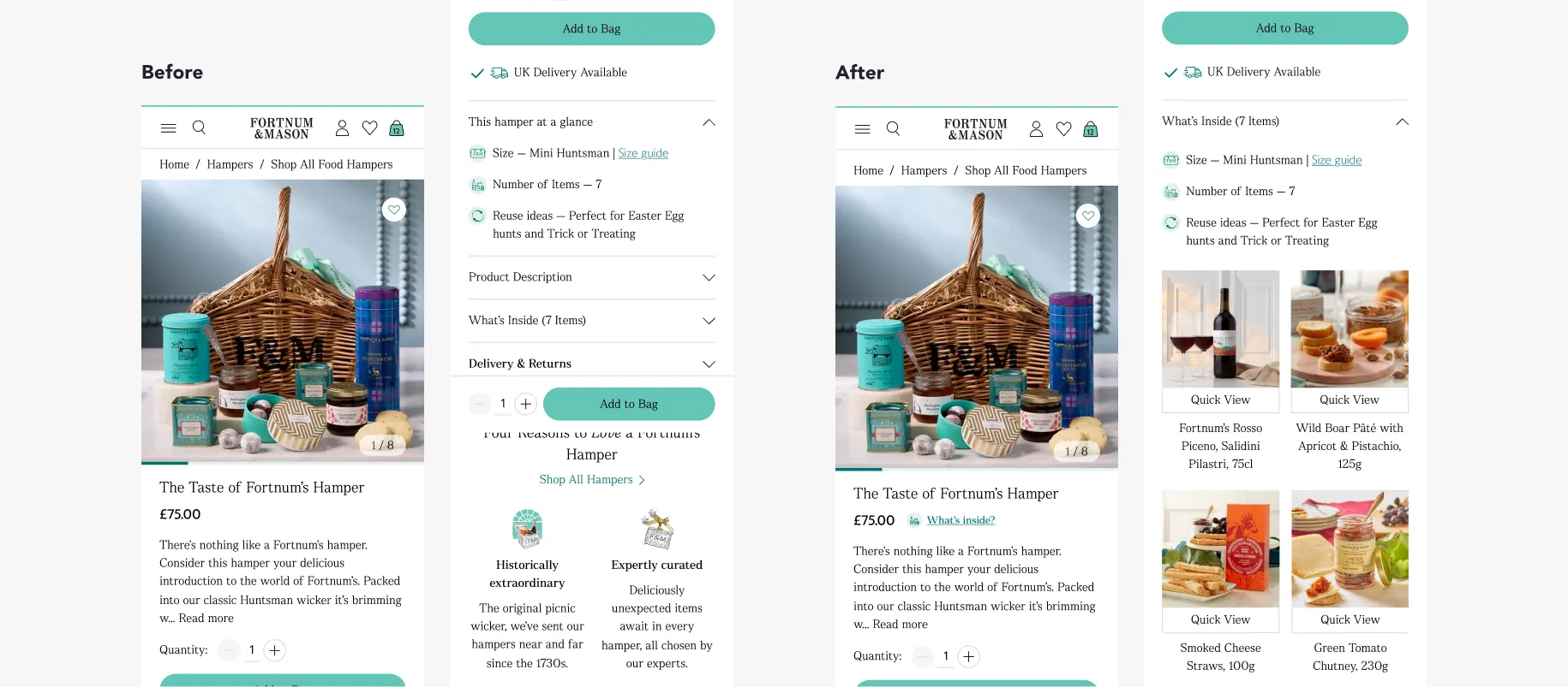
Mobile PDPs represent a significant entry point, yet bounce rates were high and key product information, particularly hamper contents, was not being seen by a large proportion of users. Existing interactions required users to actively expand accordions, creating friction at a critical decision-making stage.
Change
REO consolidated product information into a single “What’s inside (X items)” section, surfaced higher on the page and opened by default. A direct link was also introduced near the price, allowing users to quickly jump to the contents.
Result
Delivered a +10.7% uplift in conversion for new mobile users. The increase was driven by improved add-to-cart rates, with no negative impact on overall user experience.
Why it mattered
Improving visibility of hamper contents reduced uncertainty for new users, helping them build confidence and make faster purchasing decisions. In a high-consideration, gift-led category, clarity of what’s included proved to be a key driver of conversion, particularly for first-time visitors who require more reassurance.
PLP Hamper Contents
Problem
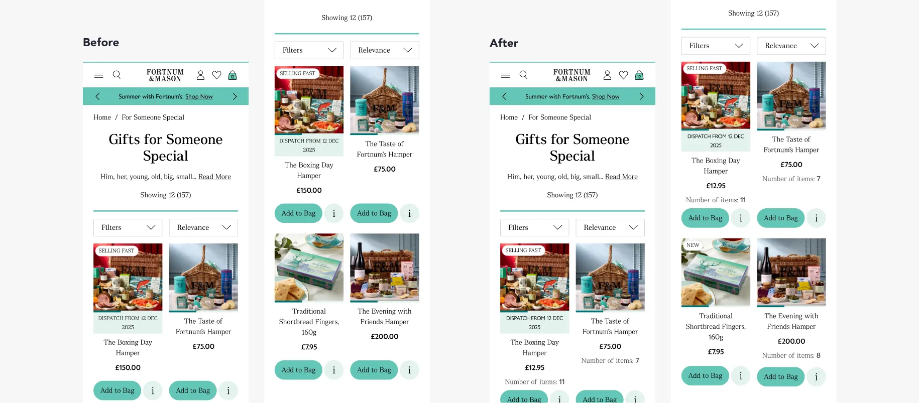
User research indicated that customers struggled to understand hamper contents while browsing on the PLP. This lack of visibility made it harder to compare options and may have created a barrier to adding products to basket.
Change
REO introduced a simple content cue on hamper listings, displaying the number of items included in each hamper directly beneath the product description and price.
Result
Delivered a statistically significant uplift in mobile conversion, with a +7.58% increase compared to the control.
Why it mattered
Providing a clearer sense of value helped mobile users make quicker, more confident decisions while browsing. In a category driven by gifting, highlighting quantity alongside price supported consideration and reduced friction at a key decision-making stage.
Single Grid View & Filters
Problem
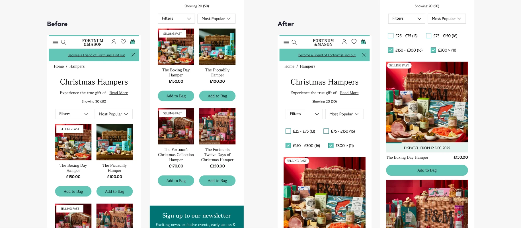
User testing highlighted limited visibility of hamper contents on mobile PLPs due to small image sizes. At the same time, users showed a strong preference for filtering by price, yet filter usage on mobile remained low, indicating friction in both product discovery and navigation.
Change
REO tested a redesigned mobile PLP with a single product per row to increase image size and improve product visibility. A second variation also introduced prominently displayed price filters at the top of the page to encourage faster, more intuitive browsing.
Result
The single-column layout led to a significant decrease in conversion (-15%), while the addition of visible price filters showed a slight negative trend. Although add-to-cart rates from the PLP increased, overall conversion declined.
Why it mattered
The test revealed that increasing product exposure alone does not improve performance. Encouraging users to add items to basket directly from the PLP led to less informed decisions and higher drop-off later in the journey.
This test was particularly important as there was a strong internal belief within Fortnum & Mason that a single-column layout would improve the user experience. By validating the idea through testing, we were able to challenge that assumption and prevent a full rollout, ultimately avoiding a change that could have cost the business millions in lost revenue each year.
The Outcome
By combining insight from Adobe Analytics, Contentsquare and continuous experimentation, REO helped Fortnum & Mason uncover the key drivers of customer behaviour across its digital journeys.
The programme identified friction within high-consideration gifting experiences and delivered targeted improvements that increased conversion, particularly for mobile and new users. With a 50% test win rate, the approach not only generated measurable uplifts but also prevented costly changes that would have negatively impacted performance.
More importantly, the partnership established a clear optimisation framework where insight, design and experimentation work together to guide decision-making and prioritisation.
Fortnum & Mason now operates with a more informed and evidence-led approach to optimisation, enabling faster learning, more confident decision-making and sustained digital performance improvement.