Skip to content


You’ve done an incredible job. There is no way we would have gone through 19 tests in that period without you. You’ve done a great job of driving us. We simply would not have achieved this without you.
David Hatchard
Our contributions
- Usability testing
- Experimentation strategy
- UX/UI design
- AB testing
Oct - Apr
7 Month Period
Our Tech Partners :



Challenges
it Luggage came to REO with a clear commercial ambition: to use data and experimentation to improve conversion rate understanding across the site whilst better understand the needs of their customers.
At the outset, the business had no established experimentation process, no dedicated CRO resource, and no framework for translating behavioural data into testable hypotheses. REO’s role was to act as both catalyst and strategic partner, embedding a rigorous test-and-learn methodology into the team’s decision-making process.
The REO approach
Approach
REO structured the project around four interconnected workstreams, designed to support both short term test delivery and the development of a sustainable internal practice at it Luggage.
User Research
We conducted moderated usability testing and behavioural analysis to surface friction points and unmet user needs across the it Luggage site. Research findings were translated directly into prioritised test hypotheses, ensuring the roadmap was grounded in evidence rather than assumption.
Test Ideation & Prioritisation
Drawing on analysis in GA4 and Microsoft Clarity, REO built and maintained a structured experimentation roadmap, scoring opportunities against potential impact, confidence and implementation effort. This gave the it Luggage team a clear view of what was being tested and why.
Test 01: Visual Size Selection
Challenge
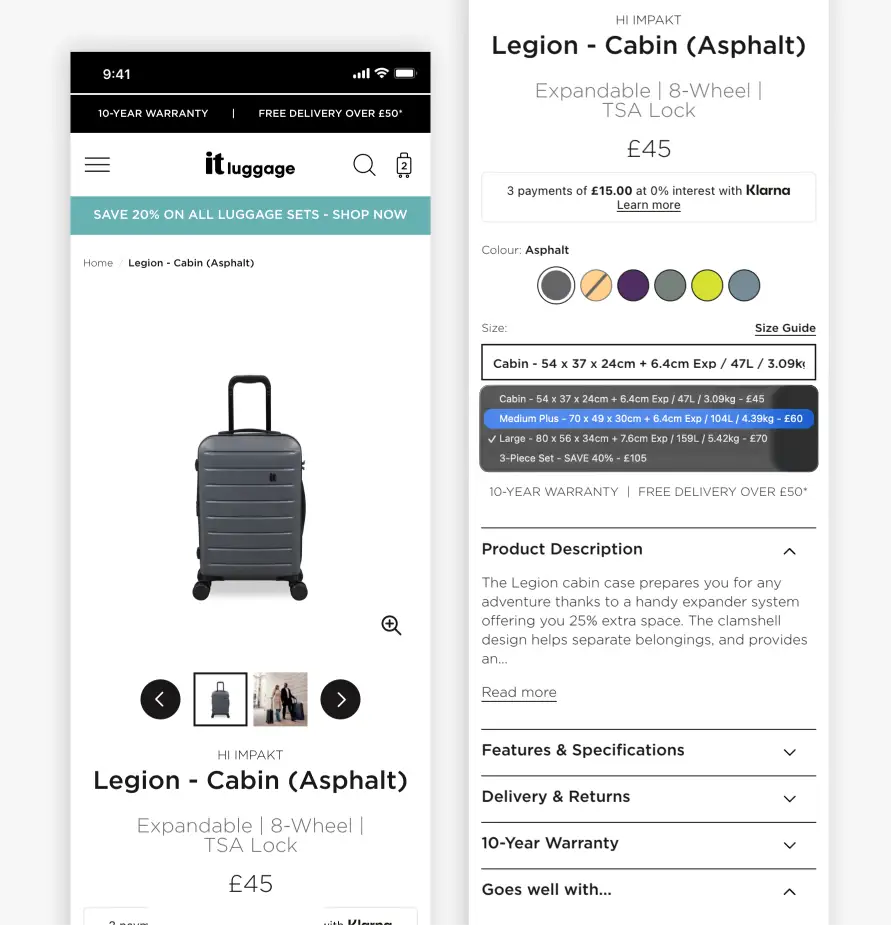
The it Luggage PDP size selector was a single dropdown that packed dimensions, litre capacity, weight and price into one line of text per option. To compare sizes, users had to open the dropdown and scroll through options one at a time. This was a significant barrier on mobile, where the majority of traffic lands.
Behavioural data made the scale of the problem clear;
Mobile Visitors interacted with the size dropdown
Desktop Visitors interacted with the size dropdown
Mobile PDP visitors were adding to basket
The information users needed to make a confident size decision (price, dimensions, capacity) was buried inside an interaction most were skipping entirely.
The challenge was to surface that critical information in a format users would actually engage with, without disrupting the broader page experience or loading it with visual noise.
REO Approach
REO began with moderated user research, conducting task-based usability testing to uncover friction points and benchmark the it luggage experience against competitors. These sessions revealed that participants often overlooked the dropdown size selector on it Luggage’s site, but responded positively to a more visual approach taken by a competitor, finding it significantly easier to scan and compare options.
“That’s exactly what I was looking for. That makes it nice and clear…”
— User Research Participant (responding to a competitor’s visual size selector)
From this foundation, REO developed a clear hypothesis: by improving the visibility of size options and pricing at the point of selection, it Luggage would see uplifts in add-to-basket rate and transaction rate.
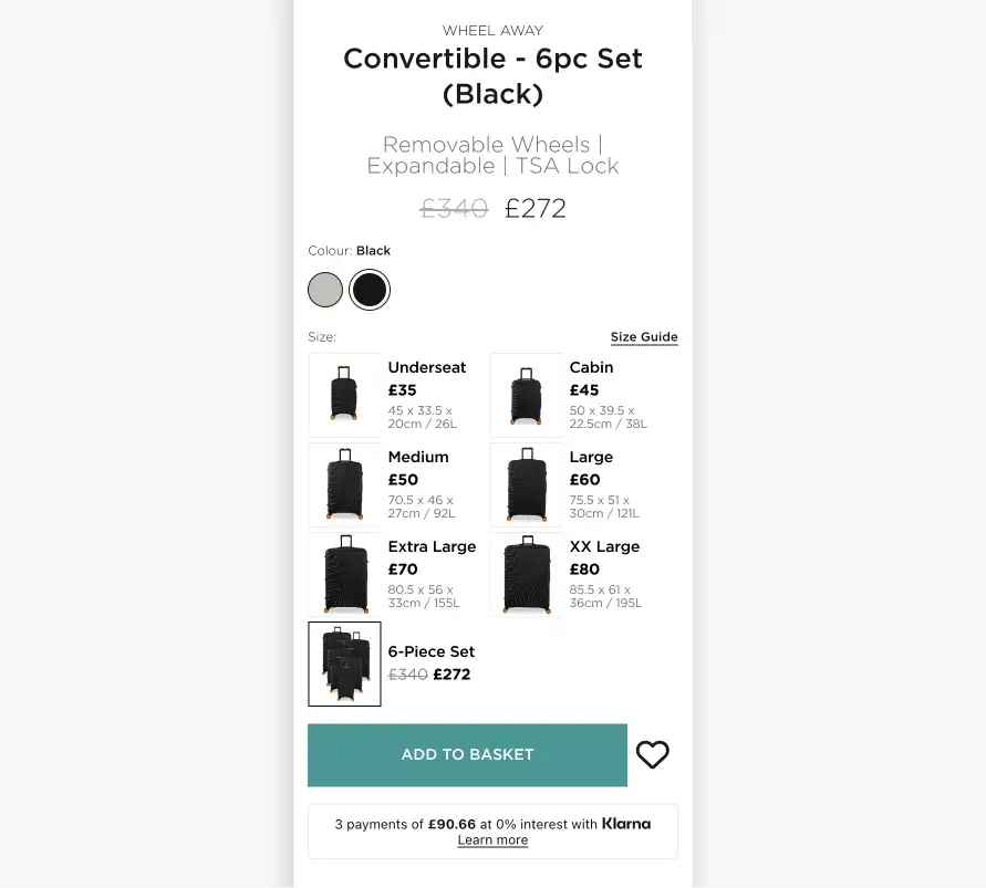
Version 1 – With Images: Grid size selector with product thumbnails: visual reinforcement of each luggage size alongside price and dimensions.
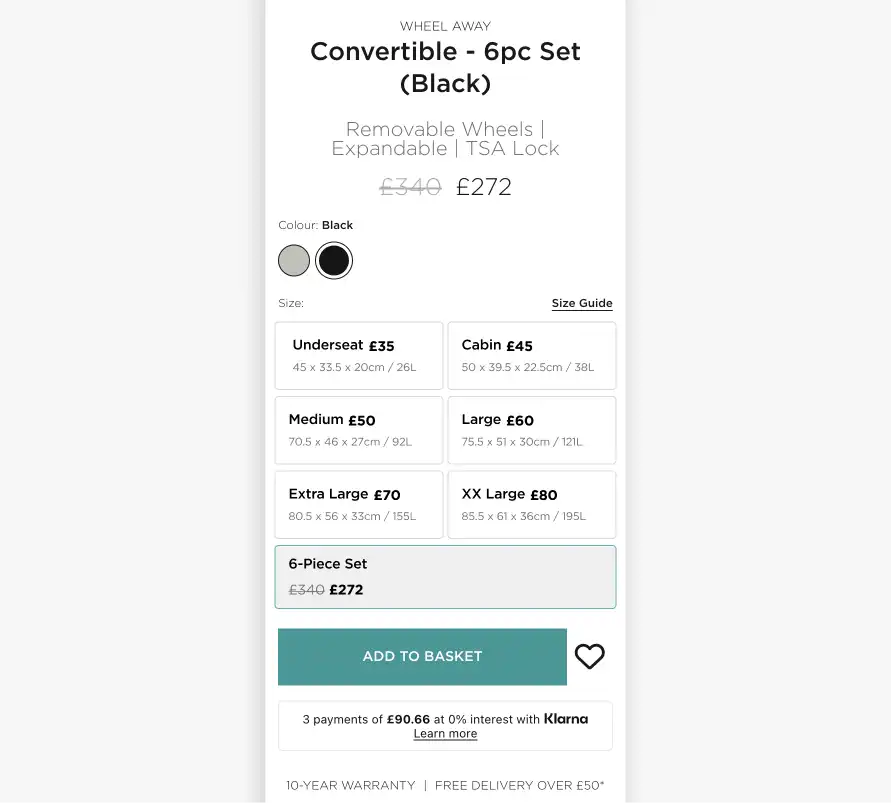
Version 2 – Without Images (Winner): Streamlined grid size selector: removing thumbnails concentrates attention on price, size and the Add to Basket CTA.
Several solutions were mocked up by REO’s UX design team, including both a slider and grid interface, and predictive eye tracking was used to pressure-test both options. The analysis showed that the grid layout allowed for better comparison between sizes, concentrating attention more evenly on price, size and the Add to Basket CTA. From there, 2 versions of the grid selector were chosen as test variants, Version 1 with images, and Version 2 without them.
Results
Both variants outperformed the control, but Version 2 — the grid without images — was the clear winner across all primary metrics, with results reaching statistical significance on both mobile and overall.
Both variants in this experiment simplified size selection by displaying all sizes on page load without any interaction required. The difference between Version 1 and Version 2 came down to how size information was presented and what else was visible alongside it.
Key outcomes for Version 2 included:
Conversion rate
Add to basket
Clicks on size selection interface
Why Version 2 won
Version 1
Version 1 included product imagery within each size tile. The images were appealing but redundant — users had already scrolled past the product gallery to reach the size selector. The imagery took up space and likely distracted from the price and size decision.
Version 2
Version 2 stripped the tiles back to the information users needed to make a choice: size name, price, dimensions and capacity. The result was a cleaner decision making surface that converted better at every stage of the funnel.
Test 02: Delivery Date Clarity
Challenge
it Luggage’s core customer is the leisure traveller: someone booking a holiday on short notice, with a set departure date and a need to ensure their luggage arrives on time. The existing PDP hid delivery information inside a “Delivery & Returns” accordion, requiring users to seek details that should have been visible at the point of decision.
REO Approach
REO hypothesised that surfacing a dynamic delivery widget directly beneath the Add to Basket button would reduce this uncertainty and accelerate purchase decisions. The widget showed customers exactly when they needed to order to receive their luggage by a given date. Two framings were tested against the control.
Version 1, the widget was prominent, time-pressured, and provided clear next steps to drive immediate user action.
Version 2, the widget was smaller and displayed similar information without specific action steps for users.
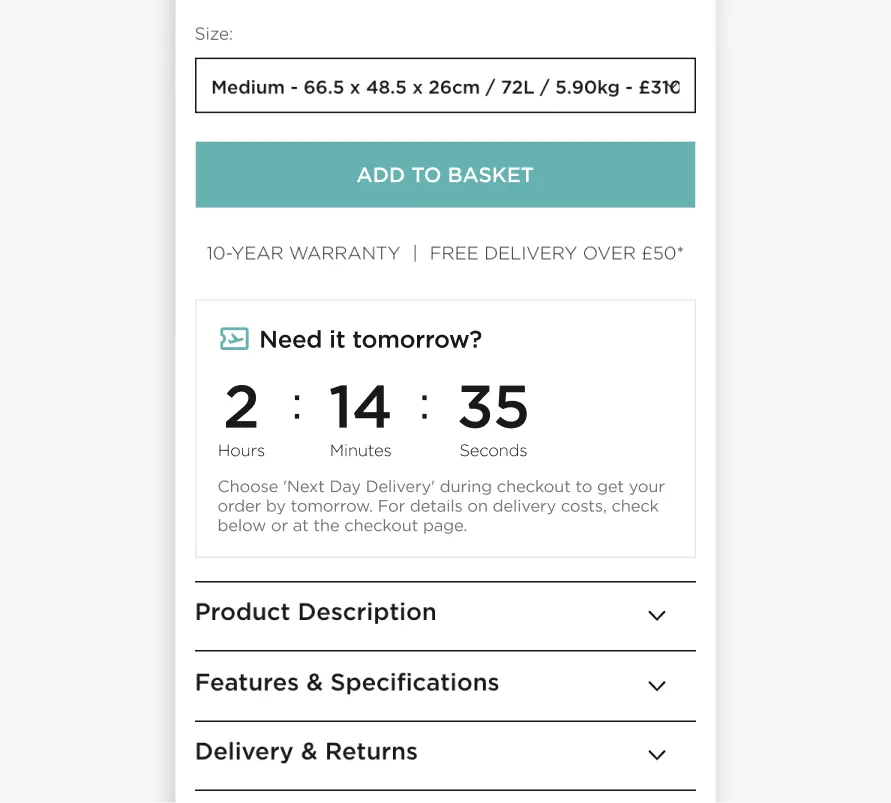
Version 1: A large countdown timer displayed hours, minutes and seconds until the next-day delivery cut-off, with the prompt “Order within XX:XX and select Next Day Delivery at checkout.”
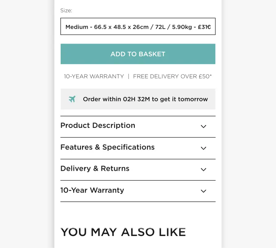
Version 2: A smaller widget provided users a light nudge but stopped short of providing a clear next action.
Results
Version 1 won decisively on mobile, delivering a +10.9% uplift in transaction rate (96% confidence) and a statistically significant +£4.31 increase in average order value.
The result suggests the urgency framing not only drove more purchases but reduced price sensitivity among those who converted. Version 2, the less action-oriented framing, produced a directional positive on mobile but did not reach significance.
The Winner: Mobile Version 1
Uplift in transaction rate
Increase in average order value
Insight
Both variants told users they could receive their luggage the next day. What differed was whether they told users what to do about it. Version 1 gave a clear instruction: order within this window and select Next Day Delivery at checkout. Version 2 presented similar information, but left users to draw their own conclusions. On mobile, the clear CTA outperformed the gentle nudge. Knowing something is possible is not the same as knowing what to do next. Users responded better when the path to action was spelled out for them.
Test 03: Airline Size Compatibility Check
Challenge
Airline cabin size restrictions are a genuine source of anxiety for luggage shoppers, particularly as allowances vary significantly by carrier and ticket type. REO’s user research surfaced compatibility as a recurring concern: participants wanted to know, before adding to basket, whether a case would be accepted by their airline without incurring excess baggage fees.
The research signal was strong. But that made this test all the more instructive, because it did not go the way the research suggested it should.
REO Approach
Two variants introduced airline compatibility information to cabin bag PDPs. Version 1 added a “Check Airline Compatibility” button near the Add to Basket CTA that opened a modal displaying a compatibility table.
Version 2 placed the same compatibility table inside the Features & Specifications accordion lower on the page, expanding on click.
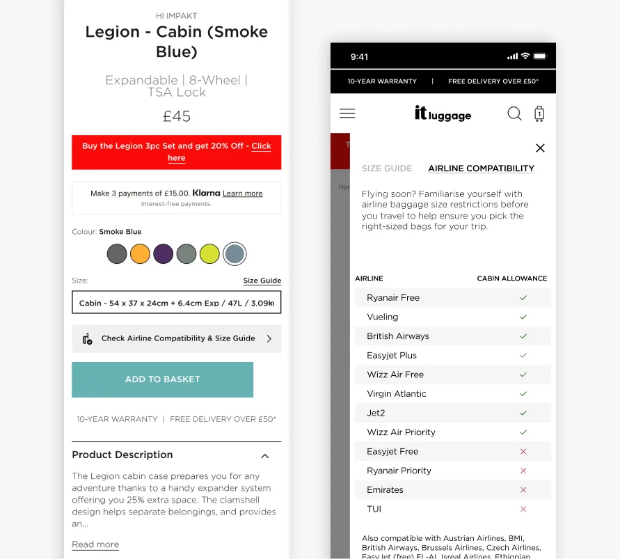
Added a “Check Airline Compatibility” button near the primary CTA
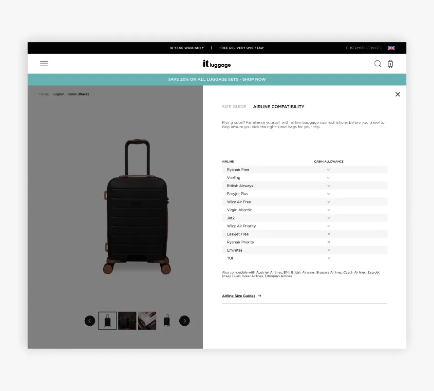
“Check Airline Compatibility” on Desktop
Results
The numbers told two different stories. In the best performing variant, Version 1, bounce rate fell by -3.8%, a clear signal that users found the information valuable and stayed on the page longer as a result.
Feature engagement was strong, with over 20% of visitors clicking the airline banner. By engagement measures, the feature worked.
But add-to-basket and transaction rate were flat. Compatibility information reduced immediate abandonment. It did not translate into more purchases.
The Winner: Mobile Version 1
Bounce rate fell
Airline banner clicks
Insight
Airline compatibility was a proven to be a real user concern, evidenced by the bounce rate improvement and engagement data. But in this case, providing a solution did not translate into more purchases. Users read the table, stayed on the page, and then left or converted at the same rate as the control. This test showed that there is an important distinction between providing a solution and removing a barrier to purchase and that the two are not always the same thing.
The Outcome
These are just three of 19 tests run across the programme. Taken together, they represent a step change in how it Luggage approaches digital decision-making and understanding customer behaviour. Perhaps the most tangible proof of that shift: the behavioural insights uncovered through experimentation are now directly informing it Luggage’s upcoming full website redesign, ensuring that the new experience is built on what their customers have demonstrably responded to, not assumptions. REO’s role was to make that transition possible — and to ensure the practice built over this engagement is one the client team can carry forward and continue to scale.