Simplifying Rate Selection Leads to +20% More Bookings for Mr & Mrs Smith
+0%
0%
Conversion rate
-0%
Cart abandonment
+0%
Revenue per session
CASE STUDY SNAPSHOT
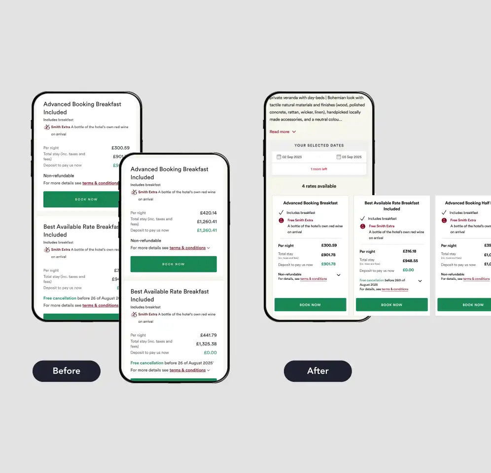
Mr & Mrs Smith’s Hotel Product Detail Page (PDP) presented multiple room types, each with several rate options, in a long-form vertical layout. For a high-consideration audience comparing boutique hotel rooms, this created a significant usability problem: users had to scroll extensively to view and compare all available options.
Our Tech Partners
CASE STUDY SNAPSHOT
Too much scrolling, too little confidence
01
User research sessions
The sessions conducted ahead of the test surfaced the low confidence issue clearly. Participants cited the vertical format as frustrating, with many finding it difficult to compare rates across rooms without losing their place on the page.
02
Problems identified
Users wanted to know how many room types were available for their dates.
Users wanted to scan room types first before drilling into rates, but the layout forced them to encounter all rate details upfront, pushing rooms down the page.
03
Supporting Data
Analytics data reinforced the reoccurring themes; a significant drop-off between the PDP and the basket pointed to friction in the rate selection stage. Customers had already shown that they respond positively to simplified navigation so this was the next logical step.
THE REO APPROACH
Built from real user feedback
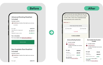
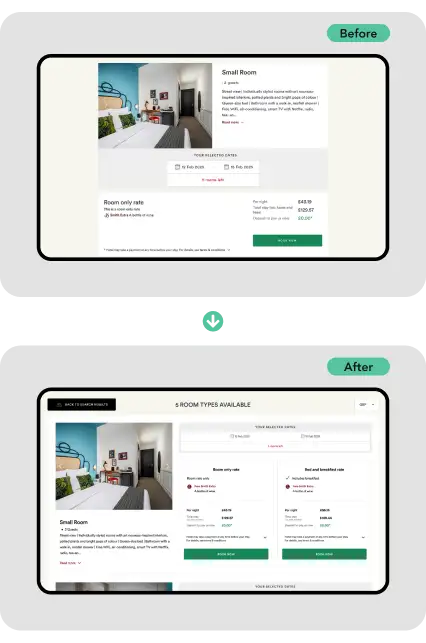
REO redesigned the rooms and rates section of the Hotel PDP to dramatically reduce vertical scroll. The key changes in the variant:
01
01
Horizontal carousel
Rate cards moved to a horizontal carousel format, allowing users to swipe between options rather than scroll through them.
02
02
Messaging and indicators
Room count messaging (“1 of 3 room types available”) and rate availability indicators (“4 rates available”) were introduced to improve navigation orientation.
03
03
Small print and important info
Terms & conditions and additional inclusions were collapsed into expandable chevron sections, reducing visual noise while keeping the information accessible.
Key findings
The test fired only once a user had entered dates, ensuring rate data was fully populated and the experience was directly comparable to control. It was scoped to mobile first, with desktop to follow if results validated the direction.
DELIVERABLES
Responsive experiments
REO always work on a ‘mobile first’ basis, and so experimented first with mobile, graduating to desktop.
01
01
Condensing mobile layout
Condensing the layout made our users more decisive.
0%
Confidence across all primary metrics
What REO did
Condensed the layout to make it easier for users to scan all room types.
Introduce horizontal rate carousels making comparing options more intuitive. This meant that users browsed and booked more deliberately.
What didn’t work
Add to Basket was the one metric that fell, down 6.2% in the variant — but this isn’t a drop in demand. Alongside the 7.7% reduction in cart abandonment, it suggests users are moving straight to booking rather than adding to basket and dropping off later.
The Results
The condensed format encouraged exploration over drop-off. Conversion rate, cart abandonment, revenue per session, and scroll depth (up 25.3%) all improved, showing stronger engagement.
Premium rooms, previously buried lower in the default sort order, saw increased bookings once the full range was visible, showing users were more willing to trade up.
+0%
Conversion rate
-0%
Cart abandonment
+0%
Revenue per session
+0%
Scroll depth
02
02
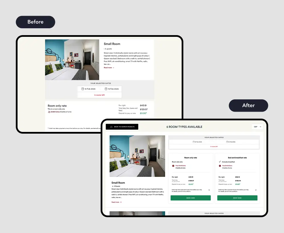
Extending to desktop
Following the mobile win, REO extended the test to desktop.
0%
Confidence across all primary metrics
Desktop Results
Running the same condensed layout and horizontal rate view was adapted for a wider viewport. The results closely mirrored what mobile had shown, and in some areas went further with, for example, conversion rate increasing to +24.4% on desktop. That is a further 2.2% extra.
New visitor conversion
For first-time visitors, a layout that clearly displays all room types and makes rates easy to compare seems especially effective. This reduces friction that might otherwise cause hesitation or drop-off.
Increasing by 38.3% at 99% confidence.
+0%
Conversion rate
-0%
Cart abandonment
+0%
Revenue per session
+0%
New visitor conversion rate
INSIGHTS
What the results tell us
01
Scroll kills conversion in high-consideration contexts
When users must scroll extensively to compare options, they disengage before making a decision. Condensing the layout didn’t remove information, it just reorganised it in a way that matched how users actually wanted to browse.
02
Fewer add-to-baskets, stronger purchase intent
The slight decline in Add to Basket rate reflects a change in the quality of basket additions, not a loss of intent. Users who added to basket were more certain, more likely to complete, and as the premium room data suggests, more willing to spend.
03
New visitors benefited most
The strongest uplift on desktop came from first-time visitors. A clearer, less overwhelming booking experience lowered the barrier for users who hadn’t yet built familiarity with the Smith flow — a meaningful finding for future optimisation.
04
Mobile-first sequencing de-risked desktop rollout
Testing on mobile first gave REO a strong directional signal before committing to a desktop build. By the time the desktop variant launched, the hypothesis was well-evidenced, reducing risk and shortening the path to rollout.
BUILDING ON THE WIN
Further Rate Selection Experiments
Testing navigation, orientation and comparison on the Rooms & Rates page
"Back to search results" CTA
Unlike most travel sites, Mr & Mrs Smith keeps listings in a single tab, so users move from search results to hotel page to rooms and rates in one flow. Getting back to search previously meant backtracking through the hotel overview first. We added a CTA at the top of the rooms and rates page that jumps users straight back to their search results, cutting out that extra step.
Multiple room filtering
We tested a “Sleeps up to” filter with clearer messaging on how many rooms a guest needed, aiming to help users reach the right room type faster. Results were inconclusive: the filter was used in 5.1% of sessions but didn’t move Add to Basket or conversion. This pointed us toward a different fix: surfacing the date and guest picker above the room listings for users who land on the page without that information already set.
+0%
Uplift in conversion rate
+0%
Rooms & rates page/session
FINAL THOUGHTS
What's next for rate selection on the Hotel PDP
On-going experimentation
Rate selection remains a key area of ongoing experimentation for Mr & Mrs Smith.
Next steps
The next test tackles collapsible rate carousels: for hotels with more than three rooms on mobile, carousels will start collapsed, giving users a clearer overview of room types before they click in to view rates for a specific room.
The aim
The aim is to give users more upfront comparison between room types with less scrolling, building directly on the orientation and navigation improvements already validated in this workstream.
Sign up
Worried we'll send you crap? Don't. No crap. No spam. Only the best insights.
 Skip to content