Skip to content
Introduction
- Insufficient colour contrast
- Missing alt text
- Link issues
- Form field issues
- Time-outs cannot be controlled
- HTML issues
- Inaccessible interactive content
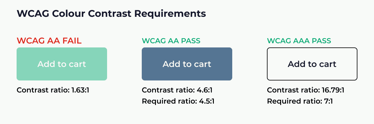
1. Insufficient colour contrast
During WebAIM’s programmatic analysis it was found that of the top 1,000,000 homepages, low colour contrast text was the most common accessibility issue, affecting 85% of pages. For people with low vision, insufficient colour contrast between your text, background, and highlighting colour can make it exceedingly difficult to read your website content. To receive the WCAG (Web Content Accessibility Guidelines) AA level conformance rating your site requires a contrast of at least 4.5:1 on typical text, however the recommended contrast ratio can vary depending on the size of your text.
Colour contrast is an easy fix, you can either fix it wherever the problem occurs, or if it is a widespread issue, you can fix it site wide by changing the theme. You can use accessibility testing tools in the automated testing stage of your digital accessibility evaluation to assess whether your website’s colours are within the right ratio.
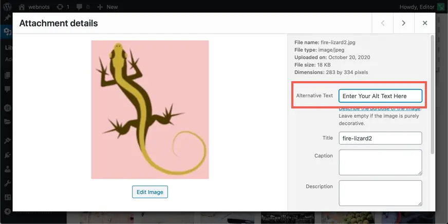
2. Missing Alt text
When adding images to your website, be it through WordPress or any other method, there is always and Alt text (Alternative text) field. It is there that you can enter descriptive text for the images that will act as a replacement if the image fails to load, and acts as a prompt for screen readers to describe the image when individuals would otherwise miss it.
Missing Alt text is another extremely common issue that is a no brainer, quick win, that anybody can start resolving easily and promptly. Again, referring to the WebAIM’s study, missing Alt text appeared on 68% of websites. If your image is informative and important to understanding the content, then you absolutely must fill the Alt text field with a descriptive tag for the image’s content. If your image is purely for visual design purposes then you should still fill in the Alt text field, however, you have freedom to be more literal and less descriptive with the tag.
Alt text issues are something that can easily be unearthed during the automated testing stage of your website accessibility evaluation. Adding this to your website imagery hosts benefits of a greater SEO ranking and better access for individuals using screen readers and those limited by slow internet or limited bandwidth. There is no excuse to miss this feature beyond lack of knowledge and laziness. Now you have the knowledge where do you fit into this?
3. Link issues
Links form the base of all web functionality and web content, without them we would be left sorting through archives of data blindly for what we require, it is for this reason that inaccessible links can be deemed a severe barrier to overall accessibility. Missing link text, ambiguous link text, links without text alternatives, and even having too many navigation links can all be marked down as potential access barriers.
Since the URL on its own is not always descriptive of the destination it is important that you include a text alternative or sufficient supplementary text to ensure that users can clearly see a flow from where they are now to where they will end up. This is especially important for users of screen readers. If you have an image or button used for navigation a screen reader may fail to interpret this, in these situations it is important that you either hyperlink applicable text or include Alt text for the link.
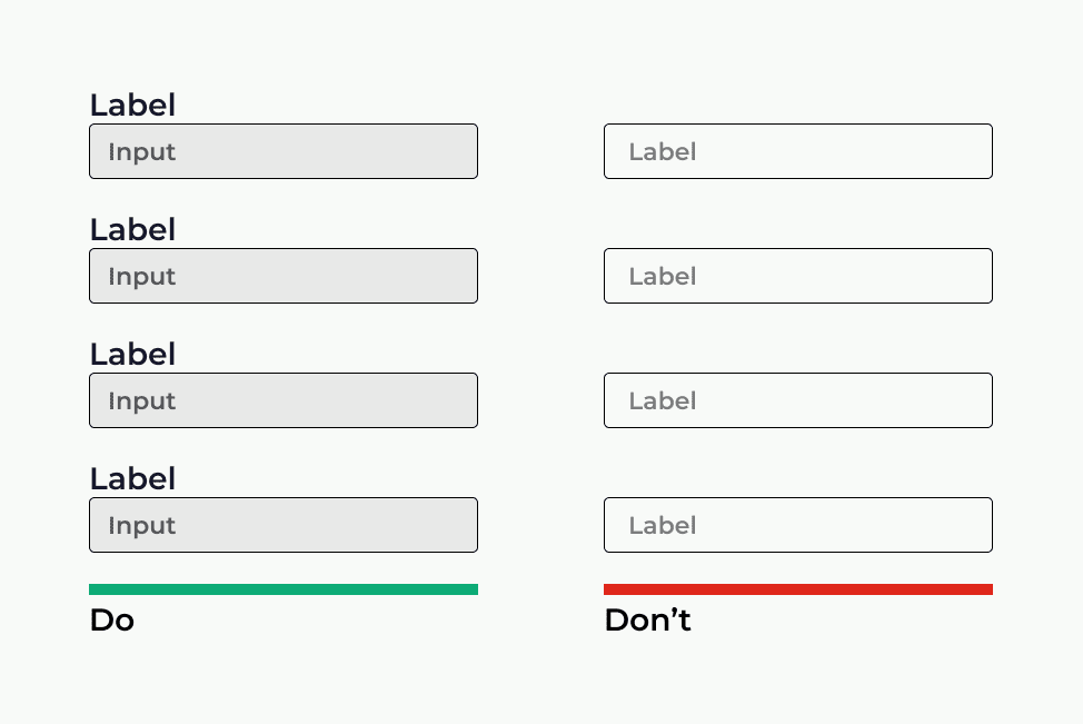
4. Form field issues
Forms are not only one of the most common website functions users interact with, but they are also one of the most common causes of accessibility issues. Empty form labels are one of the most frequently discovered issues alongside ambiguous form controls. Some form controls, such as “next page” or “submit” are clear, however a date selection drop down may not be clearly expressed with a screen reader or other assistive technology.
Form labels tell screen readers and their users what information each form field requires, what is most important is to ensure that each field is clearly labelled. A sighted user can easily match a label to the corresponding form field or option whereas this may not always be obvious for those using screen readers, to avoid this you should always aim to place the labels adjacent to, or over, their respective fields. By doing so you create clearer structure for users and increase the chances of form completion.
5. Time-Outs cannot be controlled
It is common for forms to expire after a set amount of time, this is especially prevalent with purchasing forms. While this is deemed a good thing for website security purposes it often takes longer for users with a screen reader or any other assistive technology to use forms.
In situations where this is a necessary measure to take it is crucial that users not only know when the form is going to expire but that they also can extend the time limit when needed. By ensuring that your time-outs can be controlled you save yourself from significant losses in conversion, with 71% of the disabled community clicking away from a website when confronted with access barriers it would be a shame to lose their business at the decisive point of conversion, this same point applies to non-disabled individuals, think how many people may decide not to try again if they lose their place in the ordering process and get forced to restart.
6. HTML issues
HTML structure and design of your website can be make or break when it comes to accessibility, if you have built your webpages working with an improper design system you can almost guarantee to find accessibility barriers flagged on every page. Using NATIVE html elements such as, buttons, links, and selection boxes allows you to effectively tag each element for easier access with assistive technology, like screen readers, the tags assigned to these ensure the correct flow and order for clear reading. If you do need to develop custom elements, then it is vital that they boast the appropriate ARIA support to ensure they are equally accessible as native elements for assistive technology.
Another key task is to make your site accessible is structuring your content by effectively utilising header tags. These headers build the page structure and logical reading order for people using screen readers and navigating with a keyboard. Inaccurate heading structure can make your content unorganised and extremely confusing to navigate. Luckily, issues with your page structure and layout can be easily discovered with automated testing tools, however, it is important to learn the correct page construction format to ensure that accessibility barriers are removed in development of webpages rather than removing them in post.

7. WAI-ARIA and inaccessible interactive content
WAI-ARIA, the Web Accessibility Initiative – Accessible Rich Internet Applications, is technical specification that defines a way for developers to build accessible interactive web content and web applications for people with disabilities. Interactive content includes elements like drag and drops, accordions, image carousels, and sliders. These are all common elements on a website as they allow content creators an opportunity to include more content within their limited space on a web page.
However, if you are not using the proper techniques, you could be creating traps for people using assistive technology, an individual using a screen reader or navigating solely with a keyboard could enter your image carousel and be left unable to move away from it. By inserting the ARIA attributes into your HTML code, you can help assistive technologies understand what type of content each piece is and allow for better navigation and accessibility.
Read more about WAI-ARIA web standards here: WAI-ARIA Overview