


 Skip to content
Alt text is a text substitute for images so people who can’t see the image (or choose not to load images) still get the meaning or function.
Work through these questions in order to determine if you need alt text.
No → continue to next step.
Yes → choose one:
No → continue to next step.
Yes →
Alt should describe the destination or action (what happens if you activate it).
No → continue to next step.
Yes → choose one:
Simple photo/illustration → describe the key message (briefly)
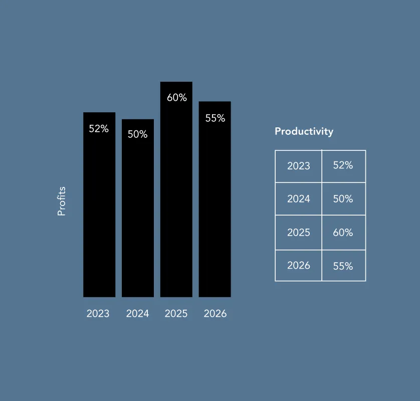
Chart/diagram/map → provide the data/meaning elsewhere (table or text summary). Use alt to name what it is (e.g., “Bar chart of 2025 booking sources”).
It repeats nearby text → use empty alt (alt=””)
No / unsure →
Treat it as meaningful and add alt, or escalate for review.
Yes →
Use empty alt (alt=””) (or better: implement as CSS background).
Use when the image adds no meaning (pure styling, spacing, ambience).
| Pattern: | alt=”” |
| Examples: | Background flourishes, dividers, abstract shapes, purely “mood” imagery when the page already communicates the message. |
| Quick test: | If you removed it, would anything important be lost? If no → decorative. |
Use for photos/illustrations that add information.
| Alt should: | capture the essential point. |
| Good: | “Woman underwater in swimming pool, surrounded by hotel building. |
| Not Great: | “Woman in pool” (too vague) |
If an image is the clickable thing (or critical to understanding the click), alt must tell users what it does.
“Search”, “Close”, “Play video”
“View room details: Deluxe King”
Tip: avoid “click here” or “link to” — assistive tech already announces it’s a link.
Usually alt should be the brand name (optionally with “home” only if needed for clarity).
| Example: | “Hyatt” / “Hyatt home” |
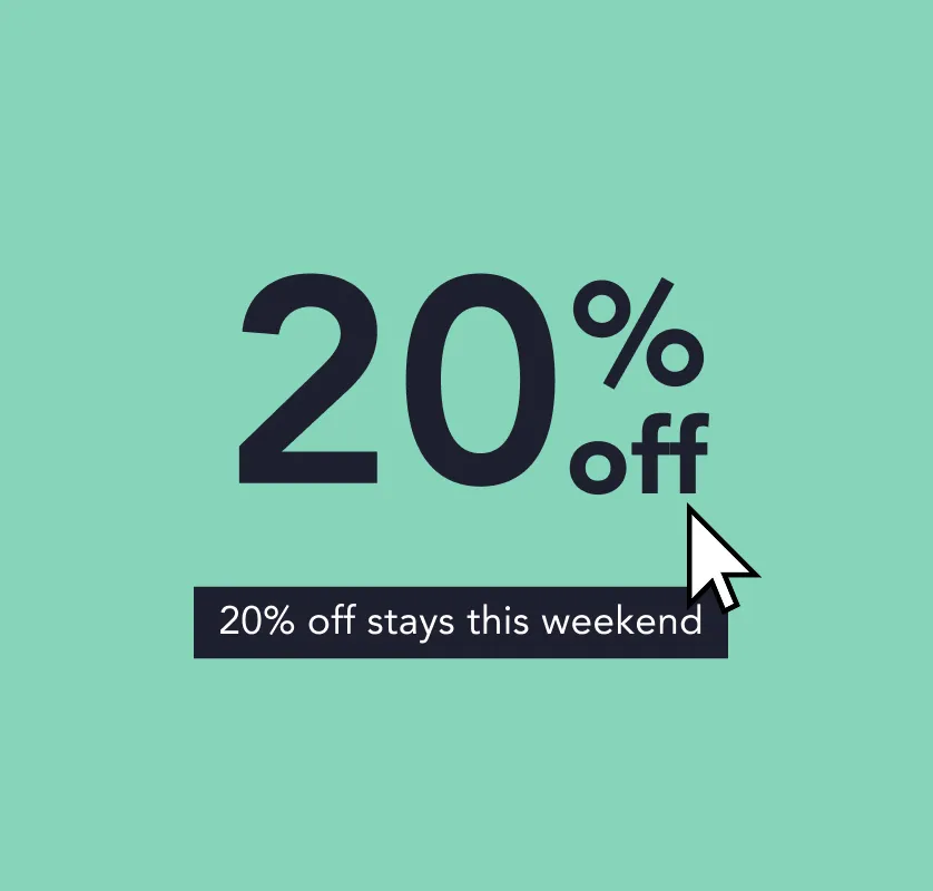
Best practice is to use real text instead of embedding text in an image. If you can’t avoid it, alt should include the same words.
| Example: | If a banner says “20% off stays this weekend”, alt should include “20% off stays this weekend”. |
Alt cannot carry an entire dataset.
“Bar chart of monthly bookings in 2025 (data provided in table below).”
If several images work together to communicate one point:
[Subject] [doing what] in/at [place], [only if it matters: key detail]
Example: “Guest using the accessible lift to reach the rooftop bar.”
[Action]
Examples: “Search”, “Filter”, “Open gallery”, “Close”
View [hotel/room name] details
If price/offer is only in the image: include that info in text or alt.
[Chart type] showing [topic] (details in [table/text] nearby)
100 Black Prince Road,
London
SE1 7SJ


Worried we'll send you crap? Don't. No crap. No spam. Only the best insights.
| Cookie | Duration | Description |
|---|---|---|
| _GRECAPTCHA | 5 months 27 days | This cookie is set by Google. In addition to certain standard Google cookies, reCAPTCHA sets a necessary cookie (_GRECAPTCHA) when executed for the purpose of providing its risk analysis. |
| AWSELB | session | This cookie is associated with Amazon Web Services and is used for managing sticky sessions across production servers. |
| cookielawinfo-checkbox-advertisement | 1 year | The cookie is set by GDPR cookie consent to record the user consent for the cookies in the category "Advertisement". |
| cookielawinfo-checkbox-analytics | 11 months | This cookie is set by GDPR Cookie Consent plugin. The cookie is used to store the user consent for the cookies in the category "Analytics". |
| cookielawinfo-checkbox-functional | 11 months | The cookie is set by GDPR cookie consent to record the user consent for the cookies in the category "Functional". |
| cookielawinfo-checkbox-necessary | 11 months | This cookie is set by GDPR Cookie Consent plugin. The cookies is used to store the user consent for the cookies in the category "Necessary". |
| cookielawinfo-checkbox-others | 11 months | This cookie is set by GDPR Cookie Consent plugin. The cookie is used to store the user consent for the cookies in the category "Other. |
| cookielawinfo-checkbox-performance | 11 months | This cookie is set by GDPR Cookie Consent plugin. The cookie is used to store the user consent for the cookies in the category "Performance". |
| JSESSIONID | session | Used by sites written in JSP. General purpose platform session cookies that are used to maintain users' state across page requests. |
| PHPSESSID | session | This cookie is native to PHP applications. The cookie is used to store and identify a users' unique session ID for the purpose of managing user session on the website. The cookie is a session cookies and is deleted when all the browser windows are closed. |
| ppwp_wp_session | 30 minutes | No description |
| time_zone | session | No description available. |
| viewed_cookie_policy | 11 months | The cookie is set by the GDPR Cookie Consent plugin and is used to store whether or not user has consented to the use of cookies. It does not store any personal data. |
| webinargeek | session | No description |
| Cookie | Duration | Description |
|---|---|---|
| kameleoonVisitorCode | 1 year 14 days | This cookie is set by the provider Kameleoon. This cookie is used for storing a visitor code which helps in full stack experiment. |
| optimizelyDomainTestCookie | 5 months 27 days | No description |
| optimizelyEndUserId | 5 months 27 days | set by the Optimizely website optimization platform. This cookie is used to store a unique identifier which is a combination of an identifier and a random number. The purpose of the cookie is to track information on a per user basis. This is to allow the user to be properly identified and prevent duplicated data. |
| optimizelyRumLB | session | No description available. |
| Cookie | Duration | Description |
|---|---|---|
| _ga | 2 years | This cookie is installed by Google Analytics. The cookie is used to calculate visitor, session, campaign data and keep track of site usage for the site's analytics report. The cookies store information anonymously and assign a randomly generated number to identify unique visitors. |
| _gat | 1 minute | This cookies is installed by Google Universal Analytics to throttle the request rate to limit the colllection of data on high traffic sites. |
| _gat_UA-173349264-1 | 1 minute | A variation of the _gat cookie set by Google Analytics and Google Tag Manager to allow website owners to track visitor behaviour and measure site performance. The pattern element in the name contains the unique identity number of the account or website it relates to. |
| _gid | 1 day | This cookie is installed by Google Analytics. The cookie is used to store information of how visitors use a website and helps in creating an analytics report of how the website is doing. The data collected including the number visitors, the source where they have come from, and the pages visted in an anonymous form. |
| Cookie | Duration | Description |
|---|---|---|
| _hjAbsoluteSessionInProgress | 30 minutes | No description available. |
| _hjFirstSeen | 30 minutes | This is set by Hotjar to identify a new user’s first session. It stores a true/false value, indicating whether this was the first time Hotjar saw this user. It is used by Recording filters to identify new user sessions. |
| _hjid | 1 year | This cookie is set by Hotjar. This cookie is set when the customer first lands on a page with the Hotjar script. It is used to persist the random user ID, unique to that site on the browser. This ensures that behavior in subsequent visits to the same site will be attributed to the same user ID. |
| _hjIncludedInPageviewSample | 2 minutes | No description available. |
| _hjTLDTest | session | No description available. |
| mautic_device_id | 1 year | This cookie is set by the provider Mautic.This cookie is used for identifying visitor across visits and devices. Mautic cookies are used for supporting marketing activities. |
| mautic_referer_id | 30 minutes | This cookie is set by the provider Mautic. This cookie is used for marketing purposes. It heps in tracking people submitting forms. |
| mtc_id | session | This cookie is set by the provider Mautic.This cookie is used for setting unique ID for visitor, to track visitor across multiple websites inorder to serve them with relevant advertisements. Mautic cookies are used for supporting marketing activities. |
| uid | 1 year | This cookie is used to measure the number and behavior of the visitors to the website anonymously. The data includes the number of visits, average duration of the visit on the website, pages visited, etc. for the purpose of better understanding user preferences for targeted advertisments. |