Skip to content
Plain Language & Inclusive Writing
A practical guide for clear, accessible content
What plain language really means
Plain language is an approach. It means focusing on what the reader needs, not on sounding impressive or covering every detail at once.
A piece of communication is in plain language when people can:
- Find what they need
- Understand what they find
- Use that information confidently
This depends on more than word choice. It relies on:
- Clear wording
- Logical structure
- Thoughtful design
Part 1:
Start with the right format
Choose accessible formats
- Publish in HTML wherever possible
- Avoid defaulting to PDF
- Only use non-HTML formats when necessary
- Apply accessibility standards in Word, PDF, and presentations (e.g., headings, alt text, links)
HTML allows:
- Text resizing
- Custom colours
- Screen reader compatibility
- Easier maintenance
Part 2:
Focus on the reader
Before writing, ask:
- What does the reader need to do?
- What do they need to know?
- What information is essential?
- What can be removed?
Good plain language includes:
- All necessary information
- Very little unnecessary information
Put what matters most first.
Part 3:
Write clearly and directly
Use familiar words
- Choose words your audience already understands
- Avoid jargon where possible
- If you must use technical terms, explain them the first time
Keep sentences focused
- One idea per sentence
- Aim for shorter sentences (around 20–25 words)
- Avoid long, layered clauses
Address the reader directly
- Use “you” where appropriate
- Write in active rather than passive voice
Avoid unnecessary complexity
- Limit acronyms
- Prefer short forms over initials where possible
- Avoid metaphors or figurative language in instructional content
Part 4:
Structure for clarity
Good structure helps readers find information quickly.
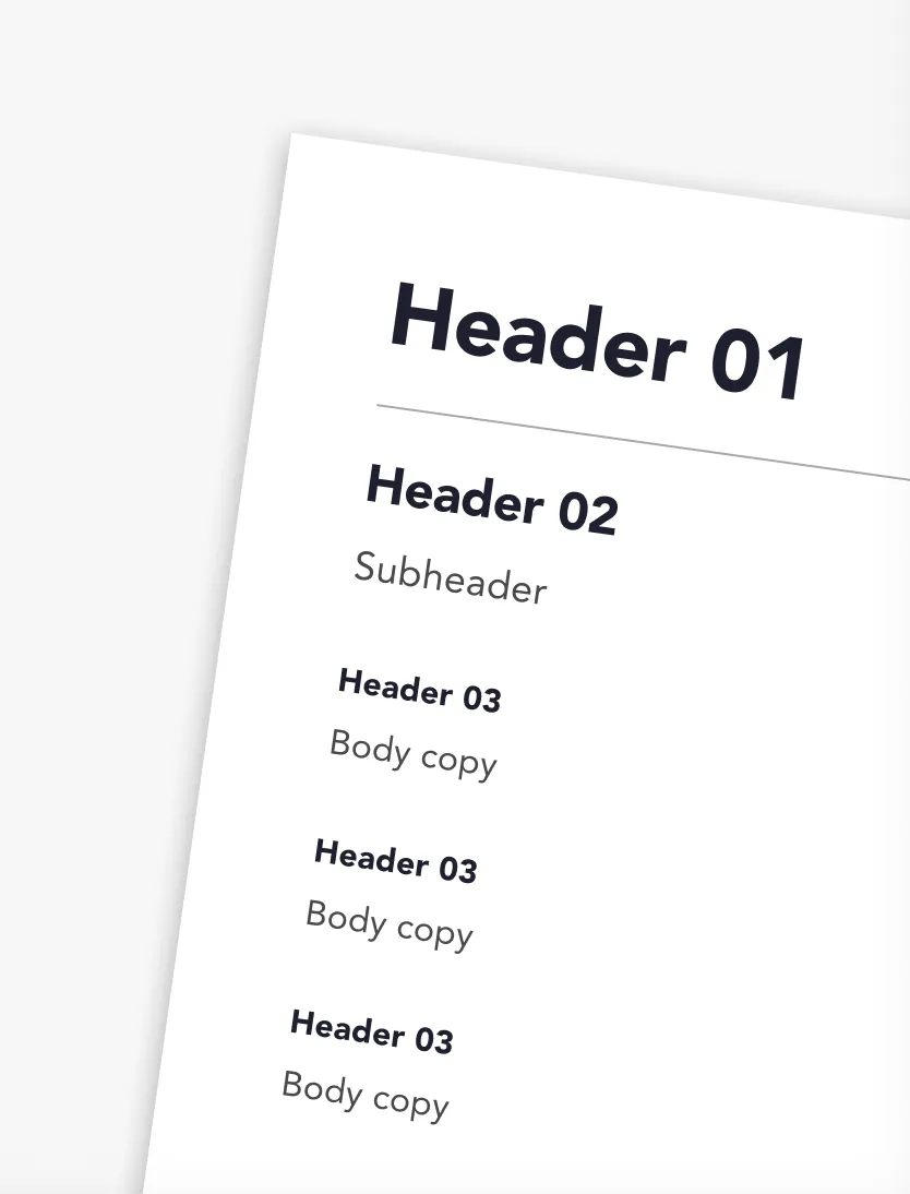
Use meaningful headings
- Give the document a clear title
- Use heading styles (Heading 1, 2 and 3) properly
- Don’t skip heading levels
- Don’t fake headings using bold styling
Manageable content chunks
- Short paragraphs
- Bullet points for lists
- Numbered steps for processes
- White space between sections
Put information in logical order
- Follow the reader’s logic, not the writer’s
- Put high-priority information first
- Group related ideas together
Part 5:
Design for readability
Design makes structure visible.
Use accessible formatting
- Sans serif fonts (e.g. Arial, Helvetica)
- Minimum 12pt in documents
- Sentence case (avoid ALL CAPS)
- Left-aligned text
- Avoid justified text
- Avoid italics for long passages
Make links meaningful
- Link text should describe the destination
- Avoid “click here” or “read more”
- Links should make sense on their own
Use tables properly
- Only use tables for data
- Keep them simple
- Use table headers
- Avoid merged or split cells
Avoid visual-only instructions
Do not write:
- “Click the green button”
- “See the box on the right”
Instead describe function:
- “Select ‘Submit’”
- “Open the booking details section”
Part 6:
Use images and media responsibly
Do not use images of text
- Cannot be resized
- Cannot be read by screen readers
Support visuals with text
If using charts, diagrams, or images:
- Include the key information in the body text
or - Provide meaningful alt text
The content must still make sense without seeing the image.
Part 7:
Support usability
Plain language supports action.
Your content should help readers:
- Understand what to do
- Avoid mistakes
- Correct errors easily
- Complete tasks without confusion
For forms and complex processes:
- Provide clear instructions
- Avoid unnecessary time limits
- Allow users to review and correct submissions
- Avoid memory-based requirements where possible
Part 8:
Make documents adaptable
Whether HTML, Word, PDF, or slides:
Ensure you:
- Use real headings, not visual styling
- Do not skip heading levels
- Use meaningful link text
- Check colour contrast
- Run the built-in accessibility checker
- Use clear, descriptive filenames
Avoid
- Decorative images used purely for layout
- Over-complicated layouts
- Multi-column designs that break reading order
- Inline footnotes where possible (explain content directly)
Final Plain Language Checklist
Before publishing, ask:
Wording
- Are sentences short and clear?
- Have I explained unfamiliar terms?
- Does it avoid unnecessary acronyms?
Structure
- Are headings meaningful and styled properly?
- Is information in logical order?
- Are paragraphs and lists easy to scan?
Design
- Is the text readable and left aligned?
- Are links descriptive?
- Is meaning independent of colour or layout?
Digital Accessibility
- Does the document work when text is resized?
- Are images supported by text or alt text?
- Has an accessibility check been run?
Reader Focus
- Is this written for what the reader needs to do?
- Have I removed unnecessary content?