Skip to content
Creating Accessible Word Documents
A practical guide for content creators.

Accessible Word documents are easier to read, navigate and convert into accessible PDFs.
They work better for:
- Screen reader users
- Keyboard-only users
- People with low vision
- People with dyslexia or cognitive differences
- People reading on mobile devices
- Everyone who benefits from clear structure
Accessibility is not an “add-on” at the end. It starts with structure.
1. Start with proper document structure
Structure is the foundation of accessibility.
Screen readers navigate documents using headings. If headings are not applied correctly, the document becomes difficult or impossible to navigate. Use Word styles, never manual formatting.
Do:
- Use Heading 1 for the document title (only once)
- Use Heading 2 for main sections
- Use Heading 3 and 4 for subsections
- Follow a logical order (don’t skip levels)
- Keep headings clear and descriptive
Avoid:
- Bold text used as fake headings
- Skipping from Heading 2 to Heading 4
- Vague headings like “More information”
If the document is over 10 pages, add a table of contents using Word’s built-in feature.
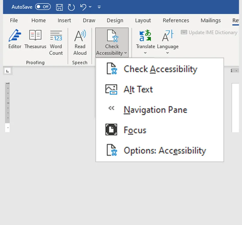
2. Use the accessibility checker
Word includes a built-in accessibility checker.
Go to:Review > Check Accessibility
Use it throughout the drafting process, not just at the end. It will flag issues such as:
- Missing alt text
- Poor table structure
- Low contrast
- Missing document title
The checker does not replace manual review, but it is an essential first step.
3. Format text clearly and consistently
Use readable formatting.
Do:
- Use a standard sans serif font (for example Arial or Calibri)
- Minimum 12pt font size
- Left align text
- Use single column layout
- Add spacing using paragraph styles, not repeated line breaks
- Insert page breaks properly using Insert → Page Break
Avoid:
- Small font sizes
- Justified text
- Multiple columns (unless absolutely necessary)
- Pressing Enter repeatedly to create space
- Text boxes (many screen readers skip them)
Ligatures (joined letters like “fi”) can cause issues in some fonts. If possible, disable them in your font settings.
4. Write in plain language
Accessible formatting cannot fix inaccessible writing. Clarity is King.
Do:
- Use short sentences
- Use simple grammar
- Use active voice
- Use bullet lists where appropriate
- Explain acronyms the first time they appear
- Write at approximately a 9-year-old reading level
Avoid:
- Overly technical language
- Long dense paragraphs
- Unexplained abbreviations
- Decorative or “impressive” vocabulary
5. Create accessible links
Link text should clearly describe the destination and should make sense out of context.
Do:
- Use descriptive link text
- Place links in the body text
- Check that links work
Avoid:
- “Click here”
- “See report”
- Long raw URLs pasted into paragraphs
- Footnote-only links where possible
6. Use lists properly
Improper lists confuse assistive technology. Always use Word’s built-in bullet or numbering tools.
Do:
- Use proper bullet and numbering styles
- Nest lists correctly using the Tab key
Avoid:
- Creating lists manually with dashes or asterisks
- Manually typing numbers
7. Use images and graphics responsibly
Images should support understanding, not replace it. Avoid text in images wherever possible.
ALT text principles
- Describe the purpose of the image
- Explain the information it conveys
- Do not start with “Image of…”
- Keep it concise
If you fully explain the image in the body text, you can mark the image as decorative.
For complex graphics
(for example flowcharts):
- Provide a detailed text explanation
- Include a data table if it’s a chart
- Summarise key trends in text
- Test charts in greyscale to check they still make sense.
Charts should:
- Use clear labels
- Have good contrast
- Avoid relying on colour alone
- Include a data table beneath
8. Create accessible tables
Tables should present data, not layout content.
Never use tables to position text on a page.
Good table practice:
- Keep tables simple
- Avoid merged or split cells where possible
- Add column headers in the first row
- Use “Repeat header row” if table spans pages
- Avoid empty cells (write “No data” if needed)
- Add a caption using Insert Caption
Screen readers read tables row by row, so structure matters.
9. Use colour carefully
Do not rely on colour alone to communicate meaning.
| Not acceptable: | “The red items are overdue.” |
| Better: | “The overdue items (shown in red) are listed below.” |
Contrast rules:
- Normal text: minimum 4.5:1 contrast ratio
- Large text: minimum 3:1
- Non-text elements: minimum 3:1
Best practice:
- Black text on white background
- Avoid red/green combinations
- Avoid pale colours
Use a contrast checker tool if unsure.
10. Ensure logical navigation order
Keyboard and screen reader users move through content sequentially. The reading order should always make sense.
Make sure:
- Content flows logically
- Images are placed near related text
- There are no floating elements that disrupt order
Test by:
- Using the Tab key
- Using a screen reader if possible
11. Manage footnotes carefully
Footnotes and endnotes can create barriers.
Best practice:
- Minimise footnotes
- Avoid endnotes where possible
- Include essential information in body text
Footnotes make navigation harder for many users.
12. Remove hidden data before publishing
Before finalising, go to:
File → Info → Check for Issues → Inspect Document
Contrast rules:
- Comments
- Tracked changes
- Personal information
Then:
- Add a meaningful document title in Properties
- Remove personal author metadata
- Use a clear file name (Use lowercase and hyphens.)
Use a contrast checker tool if unsure.
| EG file name: | zero-emission-buses-la-toolkit.docx |