Alt text is a text substitute for images so people who can’t see the image (or choose not to load images) still get the meaning or function.
The Alt Text Decision Tree
Work through these questions in order to determine if you need alt text.
Does the image include readable text?
No → continue to next step.
Yes → choose one:
The same words already appear nearby as real text → use empty alt (alt=””)
The text is just styling/ambience (visual effect only) → use empty alt (alt=””)
The text is acting as a control (icon/button with a word) → alt should describe the action (e.g., “Search”, “Open menu”)
The words are not available elsewhere → alt should include the same words (and ideally avoid text-in-image in future)
Is the image inside a link or button where the purpose would be unclear without it?
No → continue to next step.
Yes →
Alt should describe the destination or action (what happens if you activate it).
Does the image add meaning in this context?
No → continue to next step.
Yes → choose one:
Simple photo/illustration → describe the key message (briefly) Chart/diagram/map → provide the data/meaning elsewhere (table or text summary). Use alt to name what it is (e.g., “Bar chart of 2025 booking sources”).
It repeats nearby text → use empty alt (alt=””)
Is it purely decorative or not intended for users?
No / unsure →
Treat it as meaningful and add alt, or escalate for review.
Yes →
Use empty alt (alt=””) (or better: implement as CSS background).
Alt Text Writing Rules (the “quality” checklist)
Make it equivalent
Does the alt give the same outcome as seeing the image (meaning or function)?
Keep it short
Usually a short phrase is enough. Use a short sentence only when needed.
Don’t describe it as an image
Avoid “image of…”, “picture of…”, “graphic of…”, unless the type (e.g. “painting”) is important.
Don’t repeat what’s already in text
If the same info is already provided next to the image, avoid duplication (often alt="" is best).
Context decides the detail
Describe what matters for this page and this moment, not every visible detail.
Never skip the alt attribute
Every <img> needs an alt attribute — even if it’s empty (alt="").
Choose the right type (with patterns and examples)
Decorative images (use empty alt)
Use when the image adds no meaning (pure styling, spacing, ambience).
Pattern:
alt=””
Examples:
Background flourishes, dividers, abstract shapes, purely “mood” imagery when the page already communicates the message.
Quick test:
If you removed it, would anything important be lost? If no → decorative.
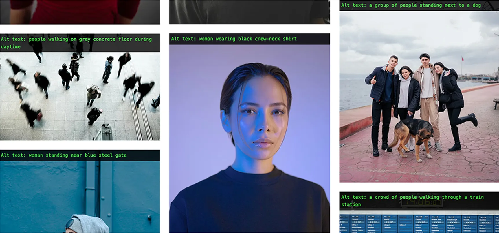
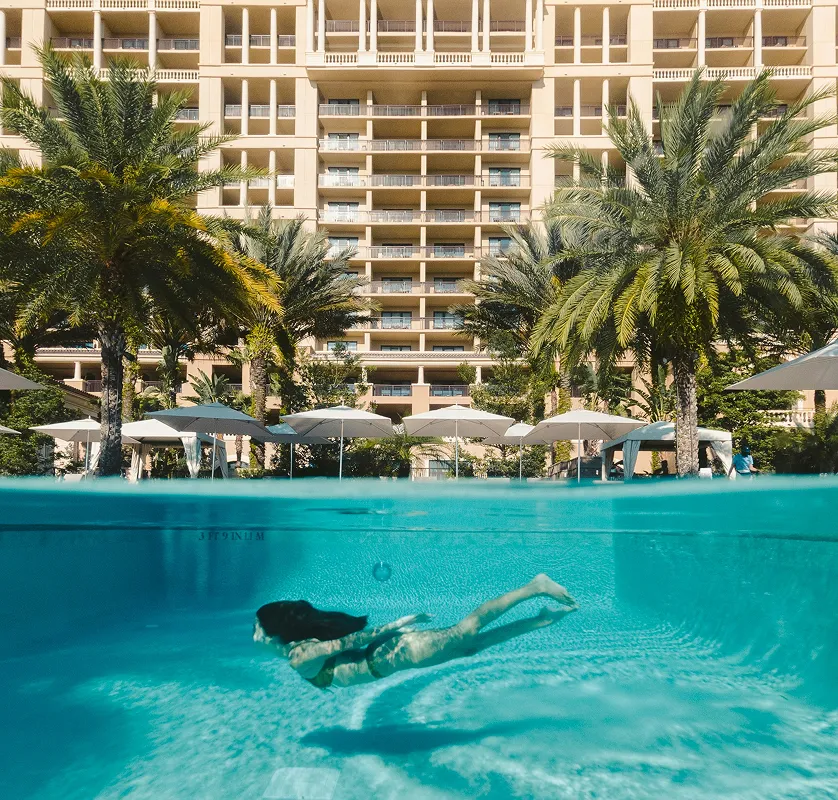
Informative images (describe the message)
Use for photos/illustrations that add information.
Alt should:
capture the essential point.
Good:
“Woman underwater in swimming pool, surrounded by hotel building.
Not Great:
“Woman in pool” (too vague)
Functional images (describe the action or destination)
If an image is the clickable thing (or critical to understanding the click), alt must tell users what it does.
Patterns
Icon buttons:
“Search”, “Close”, “Play video”
Linked image (no label):
“View room details: Deluxe King”
Tip: avoid “click here” or “link to” — assistive tech already announces it’s a link.
Logos (name the organisation)
Usually alt should be the brand name (optionally with “home” only if needed for clarity).
Example:
“Hyatt” / “Hyatt home”
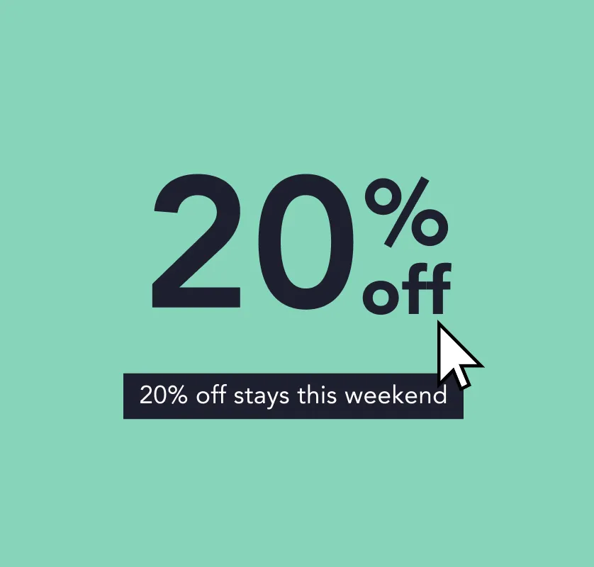
Images of text (avoid where possible)
Best practice is to use real text instead of embedding text in an image. If you can’t avoid it, alt should include the same words.
Example:
If a banner says “20% off stays this weekend”, alt should include “20% off stays this weekend”.
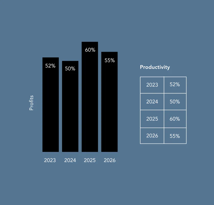
Complex images (charts, diagrams, maps)
Alt cannot carry an entire dataset.
Do this instead:
Provide the full meaning in nearby text or a table
Use alt to label what it is and point users to the equivalent content
Alt example:
“Bar chart of monthly bookings in 2025 (data provided in table below).”
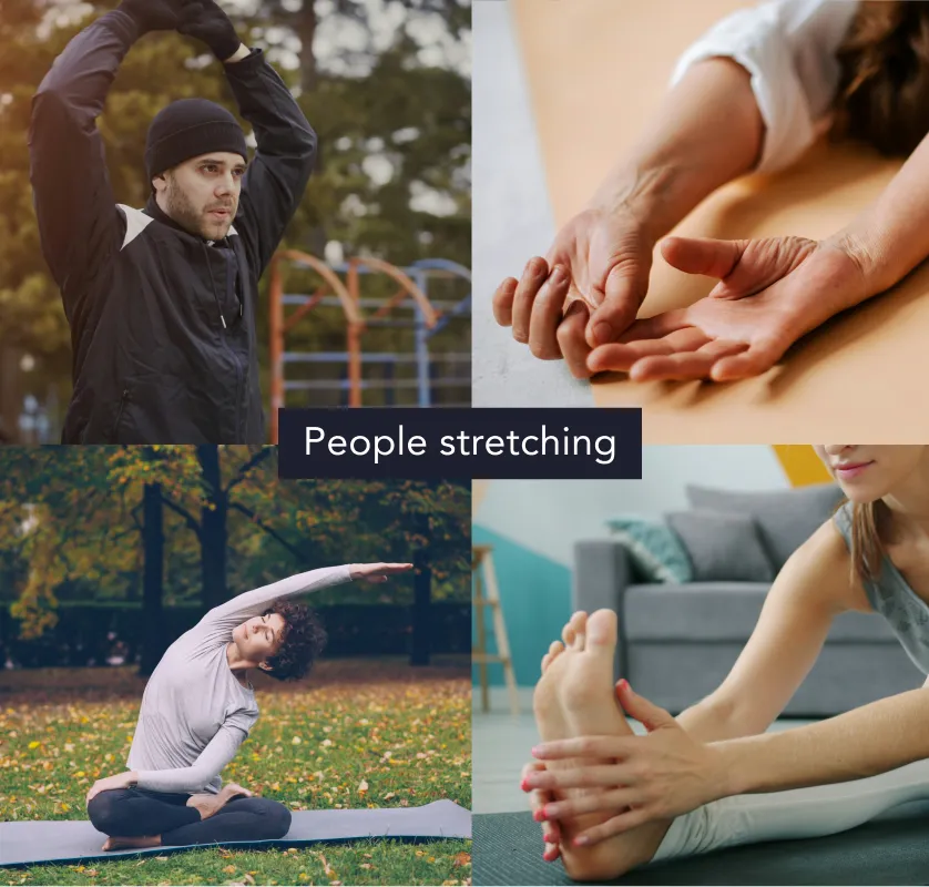
Groups of images (one message across several images)
If several images work together to communicate one point:
Provide one combined text alternative (often via nearby text/caption)
Make the other images decorative (alt=””) unless each adds unique meaning
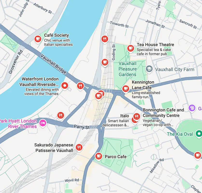
Image maps (multiple clickable hotspots)
The main image needs an alt that gives overall context
Each clickable region needs text describing its destination/action
“Do / Don’t” micro-checklist (great for content teams)
Do:
Describe purpose and meaning
Keep it brief and specific
Write it during creation, not after launch (you’ll have the context)
Don’t:
Stuff in keywords for SEO
Copy the filename
Add long, exhausting descriptions for decorative imagery
Templates your teams can reuse
Informative photo
[Subject] [doing what] in/at [place], [only if it matters: key detail]
Example: “Guest using the accessible lift to reach the rooftop bar.”
 Skip to content

 Guides and Checklist Menu


