Skip to content

Don't measure what design produced. Measure what design changed.
When I look at how design teams report on their work, the question of what it changed is usually the one without an answer.
The budget gets signed off, senior designers join and a design system goes up. Twelve months later someone asks what it all delivered, and nobody has a number ready. That’s usually the moment next year’s budget starts to look vulnerable.
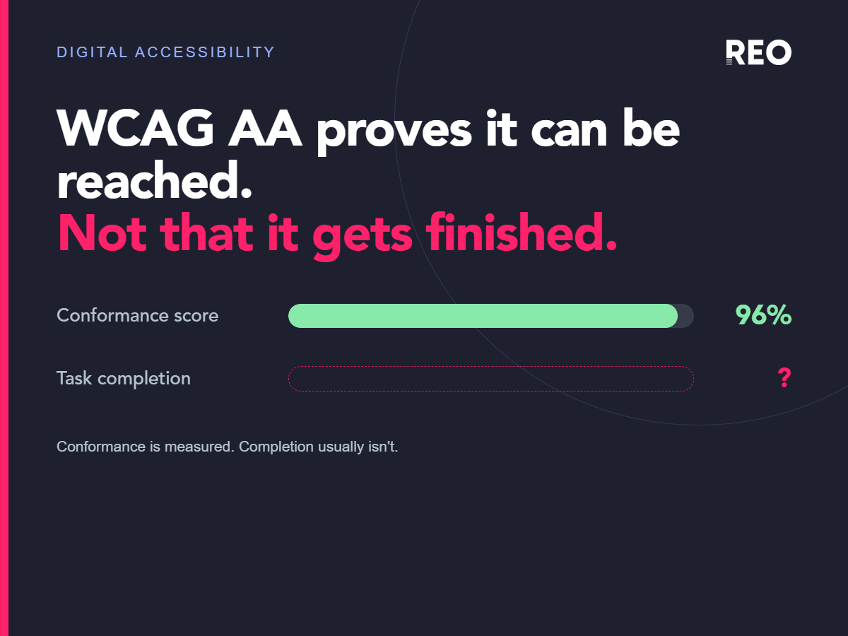
The research on what links design to financial performance points to measurement as the weak spot. When McKinsey followed 300 public companies over five years, the biggest difference between the top-performing design organisations and the rest came down to one habit, measuring and driving design performance with the same rigour as revenue and cost. Most teams report whatever is easiest instead, which tends to mean an award, a Net Promoter Score with no benchmark, or a design system adoption figure that nobody in finance can turn into money.
That’s the gap our design practice is built around. We bring the evidence discipline of a CRO team to UX design, agreeing what a project should change before the brief is signed off and reporting against it once the work is live. You can read more about our UX design practice or see how that discipline has played out for other teams.
Where the received wisdom comes from
Design teams have always had to justify themselves to people who don’t speak the language of design. For years the easiest proof was the work you could show, such as award shortlists, portfolio pieces and redesigns that looked far better than what came before. None of it needed a data partnership or the patience to wait for a metric to move. It just had to look finished.
A peer-reviewed study of design awards found that award-winning designs usually aren’t the best sellers in their category, and that awards had no statistically significant effect on enterprise performance, directly or indirectly. The signal teams leaned on to prove their value was never linked to the outcomes leadership cares about.
What McKinsey found makes the difference
The McKinsey Design Index tracked the design practices of 300 publicly listed companies for five years, across medical technology, consumer goods and retail banking. It matched more than two million pieces of financial data against over 100,000 recorded design actions.
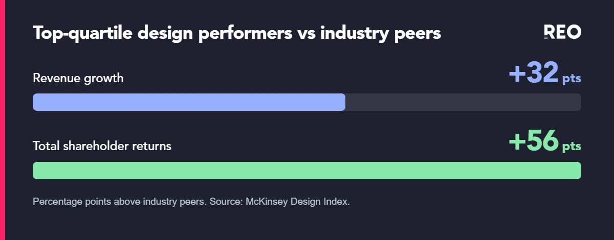
Companies in the top quartile saw 32 percentage points higher revenue growth and 56 percentage points higher total returns to shareholders than their industry peers, and the pattern held in all three industries.
The four behaviours that set the top quartile apart
The first was holding design performance to the same measurement discipline as revenue and cost. The others were breaking down the walls between physical, digital and service design, making user-centred design part of everyone’s job, and testing with real users instead of shipping and hoping.
Most teams skip the first one, because it means being prepared to find out a redesign didn’t work.
Vanity metrics, the scoreboard most teams are using
Nielsen Norman Group separates vanity metrics from actionable ones. A vanity metric is a number that almost always goes up whether or not the experience improved, such as total users, downloads, page views, social shares or award counts.
A number like that tells you very little about whether the work succeeded, because there’s no context to show whether it’s good, bad or irrelevant to what the business needed.
Turning a count into something you can defend
NN/g’s fix is to turn a raw count into a rate or ratio, tie it to a point in time and compare it against a benchmark. So “we had 40,000 sign-ups” becomes “sign-up conversion rose from 2.1% to 2.9% after the redesign, against a flat baseline for the two months before”.
The second version can be checked, attributed and challenged. Most design reporting stays at the first version because the tracking the second one needs was never set up before the project began.
How we measure what design changed
NN/g’s long-running usability ROI research, drawn from dozens of real redesign case studies, found median improvements of 87% in conversion rate, 91% in traffic or visitor numbers, 112% in user performance and productivity, and 174% in the use of specific desired features after usability-focused redesigns.
Results like those depend on groundwork most projects skip. In our design work, five steps do most of the job of proving what design delivered.
What are we trying to change?
The first step is the outcome, the business or customer result a project should change, agreed before anyone talks about deliverables. That could be conversion, revenue, retention, task completion, support contacts or time-to-ship. At kickoff we ask one question. If this project works, which number should move?
If nobody can answer that, have the conversation before design work begins. Leave it, and you’ll be having a much harder one in twelve months. A design system judged on component adoption is usually one where nobody agreed up front that the real target was time-to-ship or defect rate.
Where are we now?
Next comes the baseline. Before anything changes, we capture the starting position, the timeframe and the customer segments that matter. Without that, a conversion rate after a redesign tells you very little, and there’s no way to separate cause from coincidence afterwards.
In my experience this is the step teams skip most often, because it feels like admin before the real work starts.
Why should design change it?
Before we redesign anything, we write down our hypothesis, the reason we expect the change to work. The format we use is “We believe [design change] will change [user behaviour] because [evidence or insight], resulting in [business outcome].”
A hypothetical example would be moving delivery, returns and sizing information higher on a product page, expecting it to reduce purchase uncertainty and lift add-to-basket and conversion.
Writing it down turns the result into something you can learn from. If the number moves, you know why it moved. If it doesn’t, you know which assumption to question next.
Did it work?
Validation is where our CRO background makes the biggest difference. Wherever we can, we validate a design change through experimentation, usability testing or behavioural analytics rather than a before and after comparison alone.
In one of our tests for a retailer, we moved the content shoppers rely on to make a decision higher up a product page and tested it against the existing design. Conversion rose by 30 to 40%, a statistically significant result.
Can we reasonably say design caused it?
That’s the attribution question, and a number going up after a redesign doesn’t prove the redesign caused it. Seasonality, promotions, acquisition mix, pricing and stock can all move the same metric, so we’re clear about how confident we are that the design made the difference.
A controlled A/B test like that one sits at the strong end. Both versions ran at the same time, so the design was the only thing that differed, and that’s a result we could stand behind in any finance meeting.
A before and after comparison sits at the weaker end. It can still be useful evidence, as long as we present it honestly as an indication rather than proof.
What else to change
Take vanity numbers out of leadership updates – award shortlists and raw adoption counts are fine for a team newsletter. The report that makes the case for next year’s budget needs something that connects to money.
Review design alongside revenue and cost – borrow McKinsey’s first lever and review design performance in the same forum and with the same rigour as revenue and cost, so it’s part of the P&L conversation instead of a separate design readout.
Be ready for some results to be negative – NN/g’s own ROI research includes case studies where the impact was neutral or negative. A practice that only ever reports wins starts to look like selective reporting, and it loses credibility the first time a number doesn’t move.
If you’d like to see this in practice, our case studies show the metric agreed at kickoff alongside the number it went on to move.
Is the work failing, or is the reporting?
Before your next budget conversation, it’s worth being clear which one it is. If you can’t point to a single metric a specific piece of design work moved, with a baseline and a timeframe attached, you don’t have evidence either way.
A sceptical stakeholder will hear that silence as “it isn’t working”, whether it’s true or not. If a second opinion on where the gap sits in your own reporting would help, get in touch with our design team.
Frequently asked questions
Why isn't our design investment showing up in the metrics?
Most often the team is reporting vanity metrics, such as awards, raw traffic or adoption percentages, instead of business metrics with a baseline attached. McKinsey found that measuring design with the same rigour as revenue and cost was the strongest differentiator between top-performing design organisations and the rest, which suggests the weak point is usually the measurement around the investment.
What metrics should design be measured against?
A specific business KPI the project was meant to move, agreed before the work started and with a baseline captured beforehand. Conversion rate, task completion, retention and time-to-ship are common examples. Which one you choose matters less than defining it early and measuring it consistently.
Do design awards correlate with business performance?
Peer-reviewed research into design awards found that award-winning designs usually aren’t the best-selling products in their category, and that awards had no statistically significant effect on enterprise financial performance. Awards are a fair signal of design quality and a poor proxy for business impact.
What is the McKinsey Design Index?
A five-year study that tracked the design practices of 300 publicly listed companies across three industries and matched specific design actions against financial performance. Top-quartile scorers saw 32 percentage points higher revenue growth and 56 percentage points higher total shareholder returns than their industry peers. One of the four themes behind that result was treating design measurement with the same rigour as revenue and cost.
How do you avoid vanity metrics in design reporting?
Turn raw counts into rates or ratios and compare them against a benchmark or baseline. A change in conversion rate against a pre-redesign baseline gives you something to act on, while a total user count on its own tells you very little.
Sources
McKinsey & Company, “The Business Value of Design”, 25th October 2018
Nielsen Norman Group, “Vanity Metrics: Add Context to Add Meaning”, Aurora Harley, 13th October 2019
Nielsen Norman Group, “Return on Investment (ROI) for Usability”
Education Sciences, “The Global Design Ranking: A Case Study of Design Awards Phenomenon”, Chun-Yuan Chen, Po-Hsien Lin, Yen-Yu Kang and Chih-Long Lin, 2023