Skip to content

How leading retailers decide what to test
Ask most CRO teams how they choose what to test next, and you’ll hear some version of “we look at the analytics and pick what seems broken.” It sounds reasonable. It’s also how most testing programmes end up with a backlog full of button-colour experiments and homepage banner swaps that never move a real metric.
Actually, the retailers with the strongest experimentation track records don’t start with “what looks broken.” They start with a scoring model that forces every idea through the same objective filter, and they weight that filter so evidence and impact count for far more than how easy the change is to build. If you want the tactical how-to on running the tests themselves, The Formula for Successful A/B Testing covers that ground.
The prioritisation problem nobody admits
Every CRO team has more test ideas than dev capacity. So the real question is never what you could test. It’s what you should test first, and whether you can defend that choice to someone holding a budget.
Most teams answer this with a scoring framework and call it prioritisation. The three names that come up constantly are PIE, ICE and PXL, and the differences between them explain a lot about why some programmes stay stuck at gut-feel decisions while others graduate to something defensible.
- PIE, created by Chris Goward, scores ideas on Potential, Importance and Ease, three subjective sliders averaged into a single number. ICE, popularised by Sean Ellis, does the same with Impact, Confidence and Ease. Both are quick to run and both share the same weakness: a “7” and an “8” on Impact often just reflect who’s most persuasive in the room.
- CXL’s PXL framework was a deliberate reaction to that subjectivity. Instead of sliding scales, most of its ten variables are binary, yes or no questions like “is the change above the fold” or “was this idea based on qualitative research.” Removing the slider removes most of the argument about whether something is a 6 or a 7.
- Even PXL has a documented blind spot. Research into evidence-based prioritisation found that PXL structurally rewards ideas sourced from qualitative feedback with a higher score, regardless of whether qualitative-sourced ideas actually win more often in your own data. If your historical win rate says ideas addressing user ability outperform ideas addressing motivation, a framework that scores by category rather than by your own track record will keep steering you toward the wrong bucket.
That last point is what separates a merely objective framework from a genuinely evidence-based one, and it’s the gap REO’s own model was built to close.
Why human judgement about test ideas is a weak signal
There’s a reason to distrust the ranking your team assigns before a test runs, and it comes from the companies with the largest published experiment datasets rather than from anyone selling prioritisation advice.
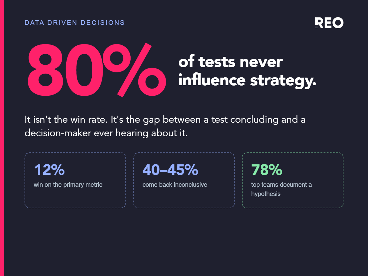
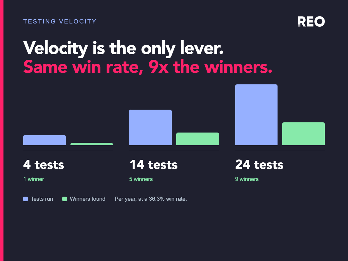
Ronny Kohavi’s figures from Microsoft’s experimentation platform are the standard reference. Across experiments there, roughly a third of ideas came out positive and statistically significant, a third came out flat, and a third came out actively negative. On Bing, a more heavily optimised product, the win rate drops to 10-20%. For Bing’s sessions-per-user metric, the one the team treated as its holy grail, about 1 experiment in 5,000 moved it. For more on why testing volume matters this much, see The Hidden Cost of Low Testing Velocity.
Then there’s the story that should unsettle anyone confident in their backlog order. A Bing employee proposed a small change to how ad headlines displayed. It was judged low priority and sat in the backlog for months until an engineer ran it as a controlled experiment on his own initiative. Revenue rose 12%, worth more than $100 million a year in the US alone, and it became the highest-revenue idea in Bing’s history (Kohavi and Thomke, Harvard Business Review). The idea was available the whole time. The prioritisation process buried it.
Airbnb’s search-relevance work makes the same shape of point: of roughly 250 ideas tested, about 20 moved the key metrics, and those 20 together produced a 6% improvement in booking conversion.
None of this argues against prioritisation. It argues against trusting confidence as an input. If two-thirds of what your team believes will work doesn’t, then the value of a scoring model comes from applying the same filter consistently to every idea, not from the model knowing in advance which ideas are good.
Why triangulated evidence still matters more than the scoring mechanics
Before any framework assigns a number, someone still has to decide what counts as evidence in the first place. The retailers we’d point to as doing this well treat evidence sources as complementary rather than substitutable.
- Baymard Institute’s benchmark, built from 200,000+ hours of usability research across 327 top-grossing ecommerce sites, is used by 71% of all Fortune 500 ecommerce companies. What separates its output from a generic checklist is the severity and frequency rating attached to every guideline, so teams prioritise by documented impact on real usability testing participants rather than by opinion. Baymard specifically flags “Missed Opportunity” guidelines, cases where usability testing shows high impact but the benchmark shows most sites still get it wrong. Exactly the signal worth hunting for before a test brief gets written.
- At REO, we’ve crunched the numbers on our own repository of thousands of test results and the highest win rates are achieved when experiments have both qual and quant supporting evidence sources, e.g. a combination of user testing feedback and funnel abandonment data. The combination of quant + qual evidence improves win rate by up to 10 points compared to a single evidence source. Experiments with a minimum of 3-4 evidence sources achieve the highest win rate, with diminishing returns beyond 6+ data points. More evidence sources also reduce the proportion of results that are inconclusive, suggesting even if the solution isn’t spot on first time, a significant behaviour change is more likely to be achieved, the insights of which can feed back into the programme.
Skip any one of these evidence types and prioritisation gets weaker in a predictable way. Analytics alone gives you correlation without a mechanism. Qualitative research alone risks over-indexing on a handful of interviews. Benchmarking alone risks importing a UX problem that isn’t actually costing your specific traffic anything.
REO's own prioritisation model
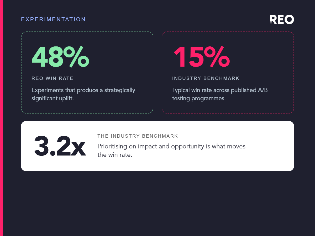
Rather than adopting PIE, ICE or PXL wholesale, REO built its own weighted scoring model. Every test idea is scored 1-10 across seven factors split into three groups: Impact and evidence (50% of the score), Reach (40%), and Ease (just 10%, deliberately capped so a quick-to-build idea can’t out-rank a genuinely high-impact one). This weighting is what produces REO’s average win rate of 48%, against a 15-20% industry benchmark.
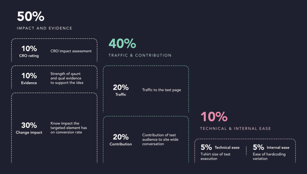
We’ve written up the full breakdown of each factor, and why ease carries so little weight, in Why experimentation programmes lose momentum.
Closing the loop
The critique of PXL above still applies to any static framework, including ours, unless it gets checked against outcomes. A weighting model is a starting hypothesis about what predicts a winning test, not a fixed truth. The retailers actually pulling ahead treat their scoring model the same way they treat any other hypothesis: they check whether the ideas that scored highest actually won most often, and they adjust the weighting when the data says otherwise.
So if you’re auditing your own prioritisation process, having a scoring framework is the easy part. The harder question is whether that framework’s own outputs have ever been checked against your actual win rate, or whether you’re still trusting a scorecard you built once and never revisited.
FAQs
What's the difference between PIE, ICE, and PXL test prioritization frameworks?
PIE (Potential, Importance, Ease) and ICE (Impact, Confidence, Ease) score ideas on subjective sliders averaged into a single number. PXL replaces most of those sliders with binary yes/no questions to reduce subjectivity, though it still has a documented blind spot around ideas sourced from qualitative feedback.
Why do most A/B tests fail to win?
Kohavi’s Microsoft data shows roughly a third of experiments are positive, a third are flat, and a third are negative. On more optimised products like Bing, win rates drop to 10-20%, showing that team confidence is a weak predictor of results.
What is REO's own test prioritization model?
REO scores every test idea from 1-10 across seven factors in three weighted groups: Impact and evidence (50%), Reach (40%), and Ease (10%), producing an average win rate of 48% against a 15-20% industry benchmark. Read the full breakdown.
Why does "ease of implementation" carry so little weight in REO's model?
Frameworks like PIE and ICE let Ease make up a third of the score, which can push hard, high-value tests to the bottom of the backlog simply because they’re annoying to build. REO caps Ease at 10% so a quick-to-build idea can’t outrank a genuinely high-impact one.
What evidence sources should inform test prioritization?
The strongest programmes triangulate multiple evidence types: analytics (correlation), qualitative research (rich but risks over-indexing on a few interviews), and UX benchmarking like Baymard’s (documented severity and frequency ratings), rather than relying on any single source.
Can a low-priority test idea still be a big winner?
Yes. A Bing ad headline change was judged low priority and sat in the backlog for months until an engineer ran it independently. It became the highest-revenue experiment in Bing’s history, generating over $100 million a year.
Sources
- Baymard Institute, UX research methodology and Fortune 500 usage statistics. baymard.com
- Ron Kohavi and Stefan Thomke, “The Surprising Power of Online Experiments”, Harvard Business Review (September-October 2017): the shelved Bing headline experiment worth more than $100 million a year. hbr.org
- Stefan Thomke, “Building a Culture of Experimentation”, Harvard Business Review (March-April 2020): Booking.com’s test-anything tenet, the December 2017 homepage experiment, and roughly 25,000 tests a year. hbr.org
- Ronny Kohavi et al., “Online Experimentation at Microsoft” and subsequent talks: the one-in-three outcome split, Bing’s 10-20% win rate, and 1 in 5,000 experiments moving sessions per user. exp-platform.com
- CXL, “PXL: A Better Way to Prioritize Your A/B Tests”. cxl.com
- GoodUI, “Better Experiments: Prioritize A/B Tests to Maximize Your Win Rate”. goodui.org
- REO Digital, internal prioritisation and weighting framework (2026).